Photoshop Workshop
Description: the purpose of this workshop is to introduce you to a few tools of Photoshop Elements or Photoshop CS:
o Resizing image and image canvas
o Layers
o Magnetic Lasso
o Move Tool
o Opacity
o Free Transform
o Text
AND to provide you a workable step-by-step process for making a visual argument
o Brainstorm in response some of the prompts (see Writing Project # 2 link on Schedule of Assignments, March 7 )
o Choose a framework for making your visual argument, for instance:
o Spoofing an advertisement (by changing text or adding different elements that undercut the original message) that relates to the identity issue you want to explore or comment on à this rhetorical move shows people that you resist (possibly in a humorous way) the media’s attempt to shape your desires, values, understanding of people, the world, etc. Examples: www.adbusters.org (see link for ad spoofs)
o Creating a collage of a lot of different images and text that show your contradictory thoughts/feelings about an identity issueà this rhetorical moves shows people that you are caught up in a Push-Pull type situation concerning some aspect of your identity. Example: Sabrina Ward Harrison’s collage journals.
o Vandalizing or in some other way “canceling” an idealization of some aspect of your identity (i.e., you “vandalize” the image that you were taught to inhabit/perform). à this rhetorical move shows people that you are angry about some “lie” that has been foisted on you concerning the world and/or what you should aspire to be Example:
o Etc. (You can review the sites and the images we’ve looked at this semester for more ideas about how to argue with visual elements)
o Use Google Images to find images and save them to your P-drive
|
|
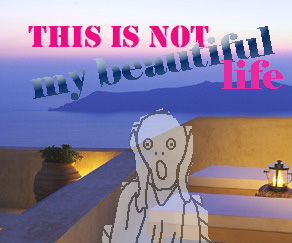
Here’s a visual argument about the “horror” of
realizing that the fantasies we have about escape, about beautiful places,
are evidence of the “matrix”—the media’s attempt to get you buy stuff because
you feel you’re HERE and NOW is not good enough. That we lack something: namely, entitlement (= power). In some sense, this is a vandalization of a picture of
a luxurious getaway. Once I found my background image, I added two elements:
a quote from David Byrne’s song, “Burning Down the House” and the guy from the
painting by German Expressionist, Edvard Munch,
called “The Scream”. I faded down the “opacity” on the scream guy and used an
eraser to knock off bits of the original graft. |
|
|
Here’s a visual argument uses the spoof-ad approach to point out the
irrelevance of our consumer choices. Whether you buy brand X or Y doesn’t
make a difference to the survival of the species but we spend so much time
spending disposable income on food, clothing, and other “life style”
products. To convey the idea of nuclear apocalypse, I looked
for images of forest fires. I found one and used it as my background. Then I googled retro and found a site that had these empty comic
book-type characters. This one reminded me of a 50’s ad for a cereal, with a
surreal twist that no one would be a brain on a box. I minimized the
“opacity” on the front image to let the back one show through. |
|
|
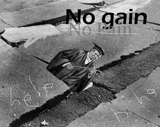
I wanted to convey something about the ill-effects of
compulsory schooling. Somehow, we’re made to understand that if you go to
school and take tests on content and skills, you will succeed in life. No one
believes that this approach makes for healthy, happy people, who, by the way,
are always the most productive. So, why do we insist on this “no pain, no
gain” approach? Matt Hern has written on this
issue, for more infor go here: http://www.adbusters.org/magazine/57/schoolsout.php
This is the collage
approach because I have inherited the whole “redemptive” work ethic: the
idea that if we work hard, people will love us for the effort we make. That
good people work hard….I also feel that this is not entirely a good thing
(thus the picture of the teacher with the switch and the scrawled word, help) I needed a background and so I wanted something
about a school, a playground…I found a cracked sidewalk. I googled “pedants” and then “corporal punishment” and
found the mean dude. I added him as a layer and then used the “Free
Transform” tool to slant him. And then I just added text and scratched around
like someone who drawing chalk. |
Your Turn
1. Create a folder on your P drive’s “Public Folder” and name it after this class.
2. Go to ”Image Bank”
3. Choose a Background image and right click on it and Save As (into your P drive)
4. Choose one or two smaller images and right click on those and Save As (into your P drive)
5. Go to Programs and Open Photoshop
6. Open all the images in Photoshop and ask yourself: will pieces of the images transfer well to the background? Or do you need to resize? {Rule of Thumb: only resize down}
7. Prepare your background by Capturing part of it and Opening a New File and Pasting
8. Now, you’ll start adding layers
9. Use the Magnetic Lasso Tool (or the rectangular selection tool) to Copy the pieces you want to add to the background. (Once you see the ant races go….then Go to Edit and Copy).
10. Use your Move Tool to move the piece around
11. Use your “Free Transform” tool (Under “Edit”) to tip it or flip it.
12. Use your “Opacity” tool (located on the Layers Palette) to fade your piece.
13. Finally, Create a New Layer and Then Click on T (the Text tool) to add some text.


