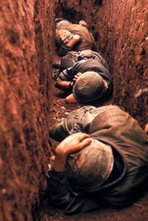
The elements in an image are essentially any shape, color or positioning that "signifies." By signifies, I mean has meaning...often because of the options NOT taken. So, in image 1, I notice the following elements:
bodies in a row, not touching, in crouching/lying position (as opposed to standing or running or hugging).
helmets are prominent (rest is hard to make out--takes effort)
hands visible on two figures (but not much else; no faces are visible; no eyes)
third figure is almost an indistinct (out of focus) blob
color: shades of brown (objects and background almost blend in)
3/4 of picture is dirt/wall
Once you have a sense of the formal elements in an image, you need to ask how they interact:
- are they balanced? right and left have symmetrical balance. Top and bottom do not; the picture has depth ( a receding--smaller--top).
- are they placed in contrast? walls contrast very little with figures. the figures, though, contrast with the scene in the sense that they are dropped into the container (trench)
- is there thematic unity? the figures are all identified (as soldiers, as scared/cowering people)
- where is the "emphasis"? first focus is on the hand holding the helmet; then the eyes moves up, and darts side to side.
- what pov is offered? (is the image framed in an open or closed form? do we "naturally" assume the pov offered or is it unusual? Does it connect us or detach us from the subjects (if there are subjects)?) the form is open, suggesting that the trench (misery) continues; the pov is that someone watching inside the trench but not necessarily "of the trench"...we are offered a safe distance from the characters. we might identify with the human beings (the hands) but we can't see much of them; like football players, these soldiers are uniformed and masked.
How is written text used (if it all)? none
- does it help classify? describe?
- are there metaphors?
Context
Is the image part of a "genre"? war photography (realistic photojournalism)
If so, what expectations does the audience have about the genre? it puts "in the trenches"; the quality is usually very good and there's usually something interesting about the place ( a dessert, a jungle, etc), something that "tells the story" of where these soldiers are.
What are the "social relationships" depicted (or alluded to) in the image? soldiers are subject to bombardment and random death; they have to take it; sometimes, it's not a matter of courage/cowardice; they just wait and see. The relationship b/w the soldiers is not necessarily one of comradeship; they're all just stuck there.
Does the image's "rhetoric" about social identity (who we are, what we want) affirm the status quo or reject it? most war journalism is neither for or against war in the abstract; often it does show us the miserable side to war. this image is pretty much in keeping with the genre; it doesn't attempt to "say" something new except that perhaps it does offer the viewer a sense of claustrophobia and defenselessness.
What other contextual factors are relevant? i found the image on a Vietnam war photograph site. the image is for sell. so, some people find images of "real world" misery, especially when rendered beautifully, worthy of displaying as art objects. Not just as "record of the event": documentary. Knowing all this, I tend to RESIST the image's attempt to get me to appreciate it's formal elegance and aesthetic understatement.

Image 1
